Stock Portfolio System FAQ
股票投资组合系统常见问题
Buffett Upside – This is the price when the sentiment shifts and the “tide goes down.” We see what the company is actually worth. This is the most basic way of calculating price and is applied to all companies.
Institution Upside – This is my best attempt to replicate how Institutions estimate stock prices. There are no official or formal ways to do this, and THIS VALUE DOES NOT REPRESENT FAIR VALUE. This often comes with high sentiment, especially during upcycles. During downcycles, this can actually be below the Buffett Price! This takes into account things like sentiment, “brand value,” or loose words like “moat.” The more often these words are used during what should be analytical valuations, the higher sentiment generally is. We quantify everything, to 2 decimals.
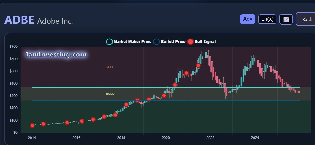
During a correction, these are the first things to disappear. Companies that have a huge % of their market cap in Institution Price historically go down the hardest. A good example of the above is Adobe (ADBE).
Sentiment Indicator – This is a custom oscillating indicator that I’ve made. It’s good at capturing bottoms (don’t use it for finding tops). It works best for stocks with ~5+ years of data. Hence, my universe of long stocks is stocks with longer history. The value will typically range from 0-100, with 0 being rock bottom. It’s an exponential indicator, meaning that the path from 0 to 20 can be 50%-100%, and from 20 to 40 another 50%-100%, etc. Values can occasionally go under 0, but only during extreme market conditions (super buy zones).
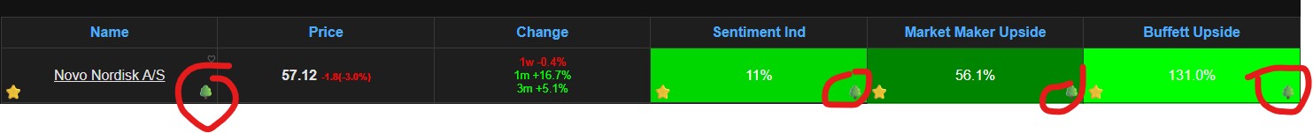
When all 3 align:
We have typically found the bottom of a stock's drawdown and can invest. And a green tree will appear.
During extreme market conditions (e.g., China / US tech stocks in 2022-2023), or during the Great Financial Crisis, both upsides can reach 100%+, even 200%+ with negative Indicator Values. At these rare points in history, we recommend selling everything you own and buy stocks.
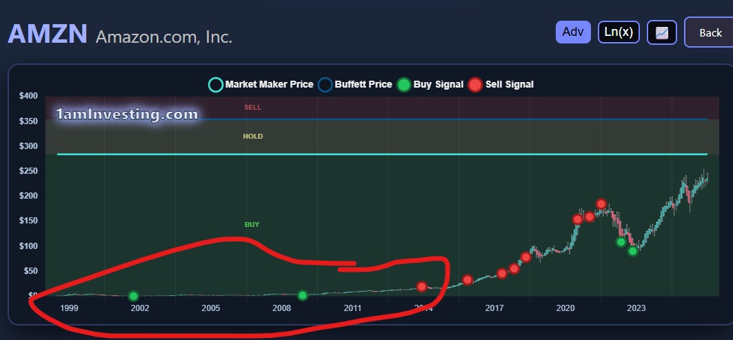
When looking at charts, we recommend the Log Scale view. Looking at something that compounds exponentially (e.g., stocks) through a linear scale is nonsense, as all old data gets squeezed out due to current “higher” prices.
It looks more reasonable in this form:
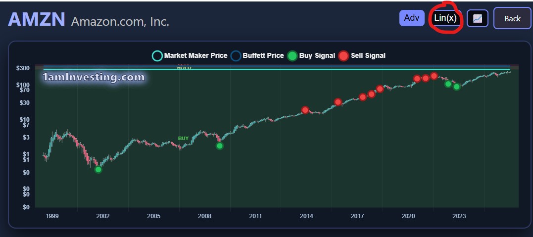
Log scale captures the time it takes for anything to double (or 10x). So the gap between 1 to 10 is the same as the gap between 10 to 100 and the same as 100 to 1000, etc. Whereas in a regular chart, the large numbers today make the earlier actions of the stock irrelevant (which they clearly are not!)
Default View - Heikin Ashi on a Monthly Chart
Uses averaged price data to smooth out market noise, making long-term trends clearer for traders. You look for extended green candles (bullish) or red candles (bearish) to confirm strong uptrends or downtrends.
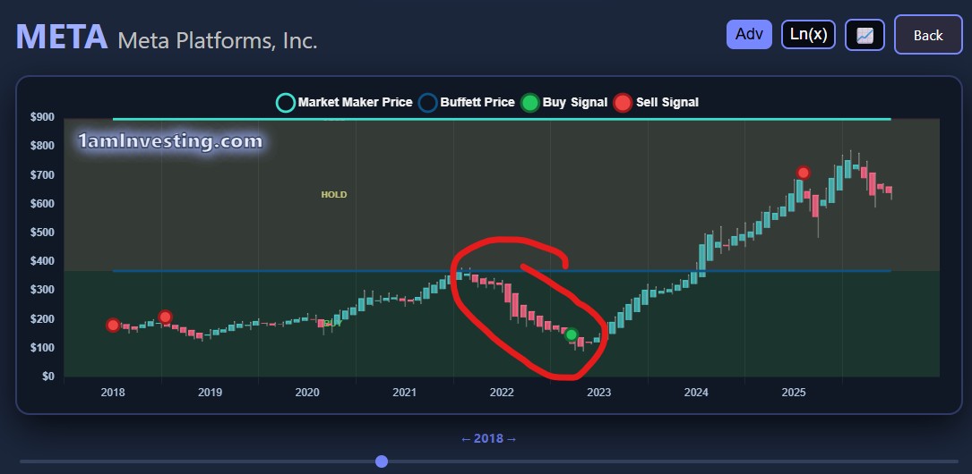
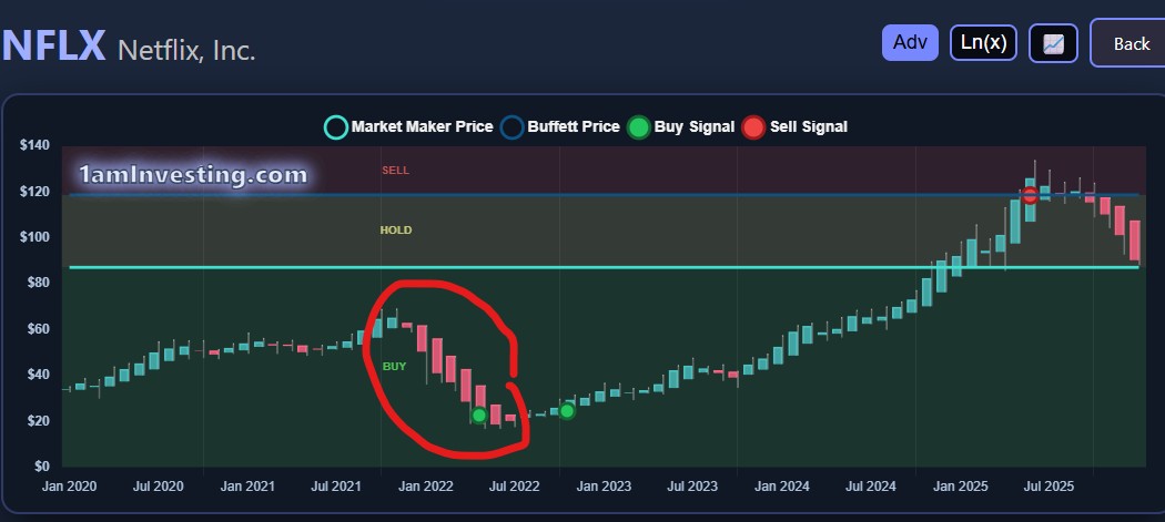
Bonus! Check out Adobe (ADBE) in image at the top of the page and Netflix above both are in current downtrends.
This helps with timing, as sometimes investing conditions are met, but the downtrend is still clear. We recommend waiting for the first green candle to be confirmed before investing. However, once upside is >100%, anytime to invest will be good. There will be times when upside will be 150%, or even more. Don’t invest with fear of missing out—be disciplined.